Developing a Brand’s Identity
What is simplegood?
Simplegood is an online men’s clothing store that takes the hassle out of shopping with its thoughtfully selected collections presented in a straightforward, easy-to-use app. Online shopping can be overwhelming and quite the headache. There are often too many options, so shoppers suffer from decision fatigue. The last thing they need is for an app to confuse them even more with unnecessary features.
I was assigned to design the branding guidelines and UI for an e-commerce app that prioritizes a simple and straightforward design. I was provided with preliminary UX research (user stories and the five W’s) and some partial branding guidelines. The goals were to create straightforward designs and develop a clear brand whose philosophy is a simple and minimalist approach to shopping.

The Challenge
Create user-centric designs that streamline the online shopping experience to help customers easily find what they need
Develop a clear branding and style guide that details design choices and requirements
My Role
UI Designer
Brand Designer
Duration
Two weeks
Tools Used
Sketch App
InVision
Brainstorming and Drawing Inspiration
Partial Branding Guidelines
“Buying from an online store has never been easier. Users are tired of the complex and unintuitive navigation systems in traditional online stores, so we provide a breath of fresh air with our sleek and dynamic experience. Our modern and clean design and smart filtering options are the major drivers of our success.”
Key Messaging:
“Shopping made easy.”
“Products that meet your needs.”
Simple, clean, and easy. How could I convey these themes in my design? For some practical examples, I looked for inspiration through Behance, Pinterest, Dribbble, and other competitors. I focused on wireframes, color schemes, and imagery that embodied those three themes. The most common iterations involved neutral or pastel color schemes, clean lines, clear labels, and straightforward functions. I generated a mood board with the best assets which I could refer to whenever I got lost.
I was provided with preliminary UX research that gave me a head start. A list of Five W’s, partial branding guidelines, and user story made it clear what issues I should address.
User Story
As a customer, I want to have access to advanced filtering options, so that I don’t have to browse through a lot of products to find what I’m looking for.
Creating the Style Guide
Full of ideas, I had a good sense of the aesthetics and visual design my app would have. I developed a brand and style guide to give this app its own personality and bring it to life. Though I didn’t get to implement all the guidelines in my designs, they would theoretically be applied throughout the whole app.
Because Simplegood’s goal is to create a pleasant shopping experience by making it easy to find exactly what the user needs, its design should follow these principles:
Simple
Keep the visual design and shopping process clean and minimal.
Versatile
Provide enough functions to tailor to different users’ preferences and different ways to complete their goals.
Easy
Make the app and its functions as straightforward as possible.
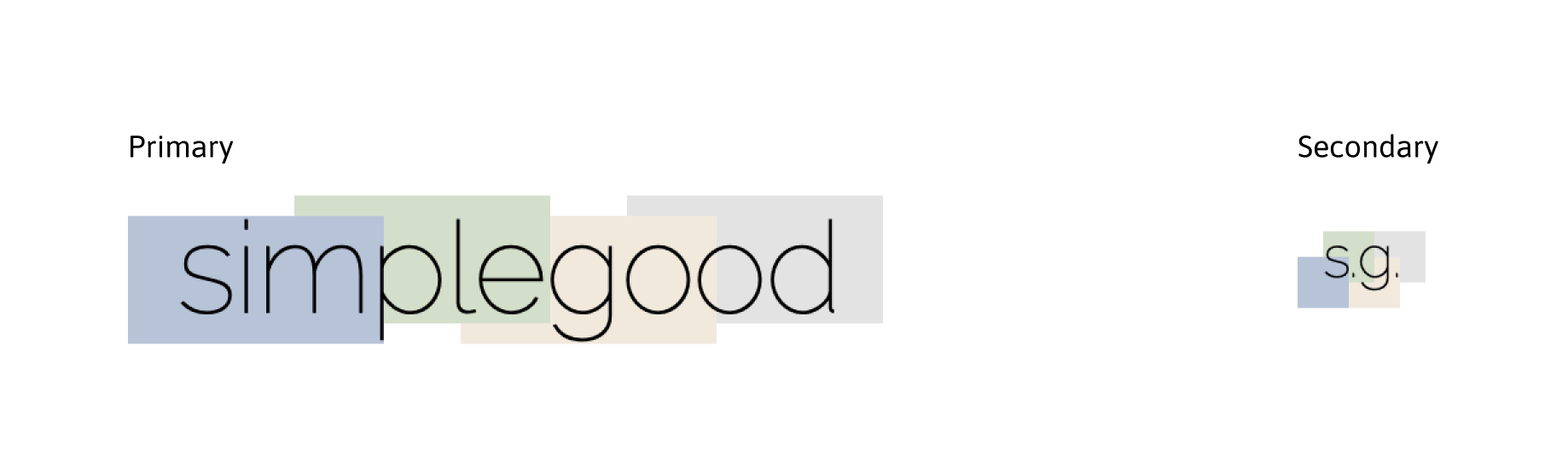
Logo
Consistent with the brand’s philosophy, the logo is very simple, so it doesn’t distract users from shopping. It uses a clean, all lower-case sans-serif font (Raleway) to be casual and implements the brand’s color palette with basic rectangles. It is also used very sparingly as to not overemphasize the brand and remain subtle throughout the app.
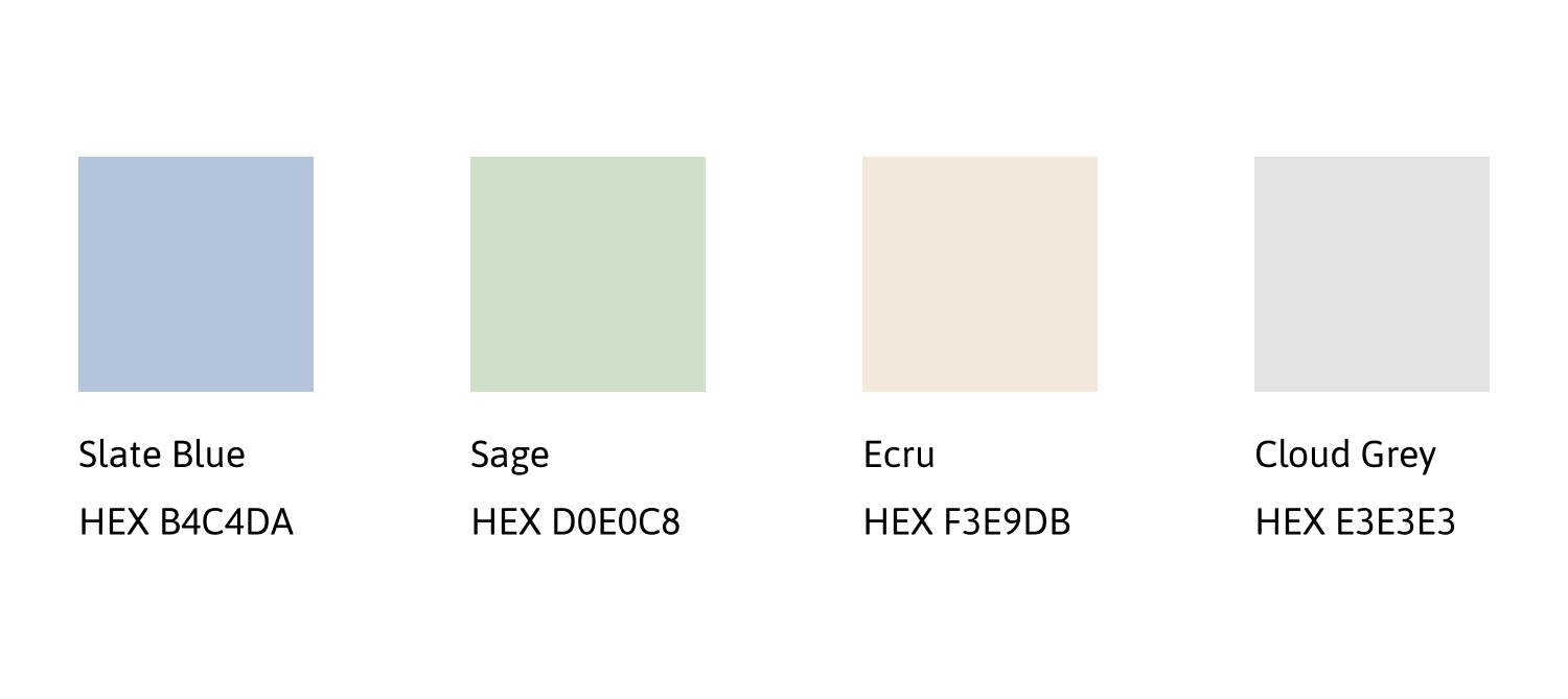
Colors
Muted pastel shades comprise the color palette to reinforce the clean, simple aesthetic and not draw too much attention. Colors are used subtly, so the products are the focus.
Typography
Both display and body text are in simple sans-serif fonts to keep the aesthetic clean. Weights are kept thin and light but substantial enough for copy to be legible.
*Additional font sizes and weights were added after developing wireframes.

Writing Style
The writing style should be simple and straightforward. Be descriptive of products but avoid hyperbolic or overly complicated language that may confuse users. Provide clear, accurate information so users can make informed choices.
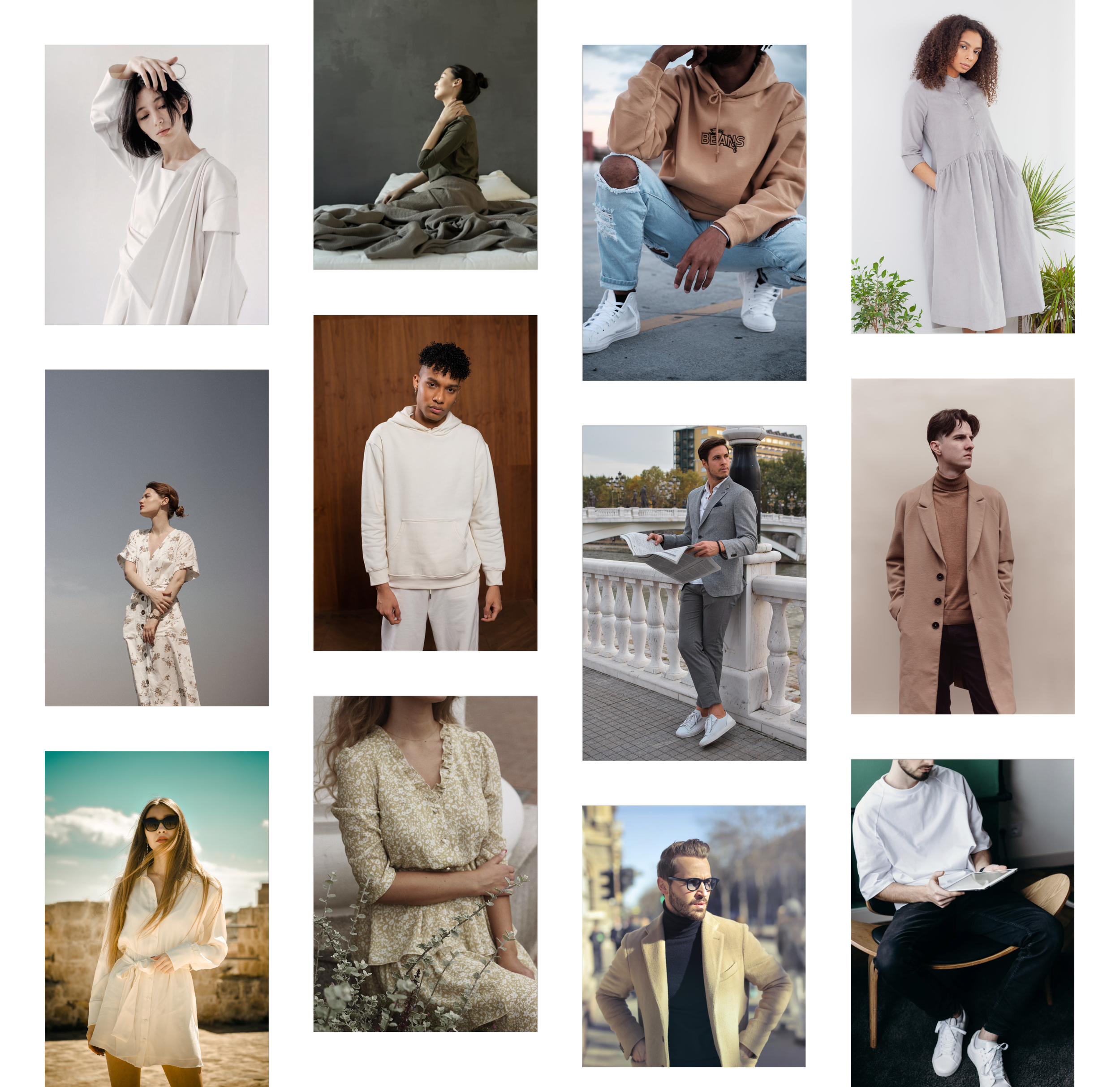
Image Style
Photographs should be clear and always focus on the products. Consistent with the brand’s philosophy, the compositions should be simple and clear. Avoid unnecessary decorations, overly bright colors, or dramatic shadows that may detract focus from the products.
Photos can be of the products alone or in natural environments that don’t clash with the simplicity.
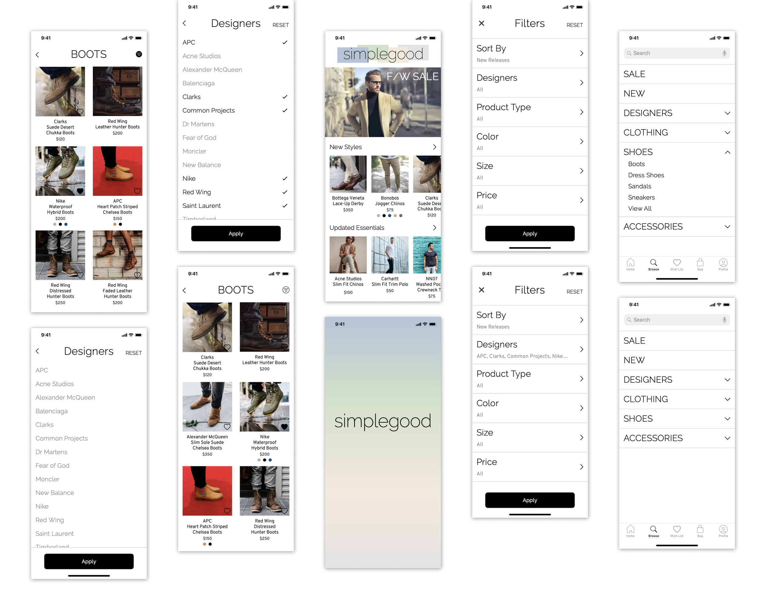
Sketching and Wireframing
With a clear vision of the designs I needed, I jumped into sketching four different versions of screens from the user story. I chose the sketches that were the most straightforward and best resembled the brand guidelines as my low fidelity wireframes. I didn’t expect to completely stick with these designs, but I at least had a starting point.
I then used Sketch App to develop my wireframes, adding additional screen states and focusing on detailed copy, alignment, and icons. I also implemented a simple splash screen that used the brand’s color palette and adjusted some images to fully bleed off the home screen instead of having narrow edges.
Applying the Style Guide
Now it was time to apply the style guide and bring the wireframes to life. I added more detailed copy, product images, and navigation icons to make this look like a real app. Unfortunately, it was difficult to implement the colors on any of the current screens; the icons would be too light and hard to read, so the splash screen would have to suffice for now.
Peer Testing
I generated a working prototype with InVision, so I could conduct usability testing. I reached out to four friends and UI design students for feedback about any confusion, pain points, or visual design. I asked testers to use the prototype to complete the task from the user story by finding some boots and filtering them for brands. I asked which paths they tried to take and if they faced any difficulty or confusion completing the task. I also wanted to know their general thoughts and impressions about the visual design.
The unsupervised testing was conducted over Slack, so I had to follow up with questions instead of immediately addressing feedback. All users found the task easy to complete and the filters straightforward, but there were still some issues to address and improve.
Refinement
To signify a clear break between the status bar and home screen, I placed the hero image at the top to create a distinct contrast and also implemented the logo.
I added icons to show available colors on applicable products.
Final Wireframes
A Reflection
Through this process, I was able to meet user needs for a simple and straightforward app and create a style guide that represents the personality of a brand. However, this came with its challenges and flaws that need to be addressed.
The biggest challenge was balancing simplicity with variety by including only necessary features. I struggled with determining which filtering options were necessary and which were superfluous. I addressed this by analyzing different competitors and choosing the most common filters, but asking users for their most essential filters would have provided the most accurate solution. This brings me to the role of user testing:
User testing was incredibly important to troubleshoot some issues, especially for a process that involves determining necessary features. However, because user testing was unsupervised and not in real-time, it was hard to identify the exact pain points and areas of confusion. Furthermore, a more specific selection of testers and details of their demographics would have yielded more accurate and relevant results, since this is an app specifically for men’s fashion.
The Style Guide
Because filtering options are such a small, specific part of a bigger app, there were very little opportunities to apply the design guidelines or show other features that a standard style guide would communicate like buttons, icons, or input fields. At this point, while the style guide certainly has the necessary guidelines for our current user journey, the rest of the app would require one that is more developed and thorough.
What’s Next?
Determining and developing other necessary features for an ecommerce app would create opportunities to further develop and implement the style guide. Product pages, checkout pages, or wish lists all create new user journeys and challenges; I plan to conduct additional, better executed user testing and design more solutions that will result in a more robust style guide and richer case study.