
Improving Home Training
The Covid-19 pandemic suddenly confined everyone to their homes. That meant no more theaters, shopping malls, or gyms. While home training had already been the norm for some, many including myself had to make big adjustments to stay fit without personal trainers or expensive equipment. Because of this, I became very familiar with home training apps, and for a student project, I researched the most common user needs and issues to improve home training with the Train24 app.

The Challenge
Conduct research on current fitness apps to determine the biggest pain points
Determine what features are most desired and essential for users
Use research data to develop an app that provides the necessary solutions
My Role
Ui/UX Designer
Duration
One Month
Tools Used
Sketch App
InVision
Starting with the Competition
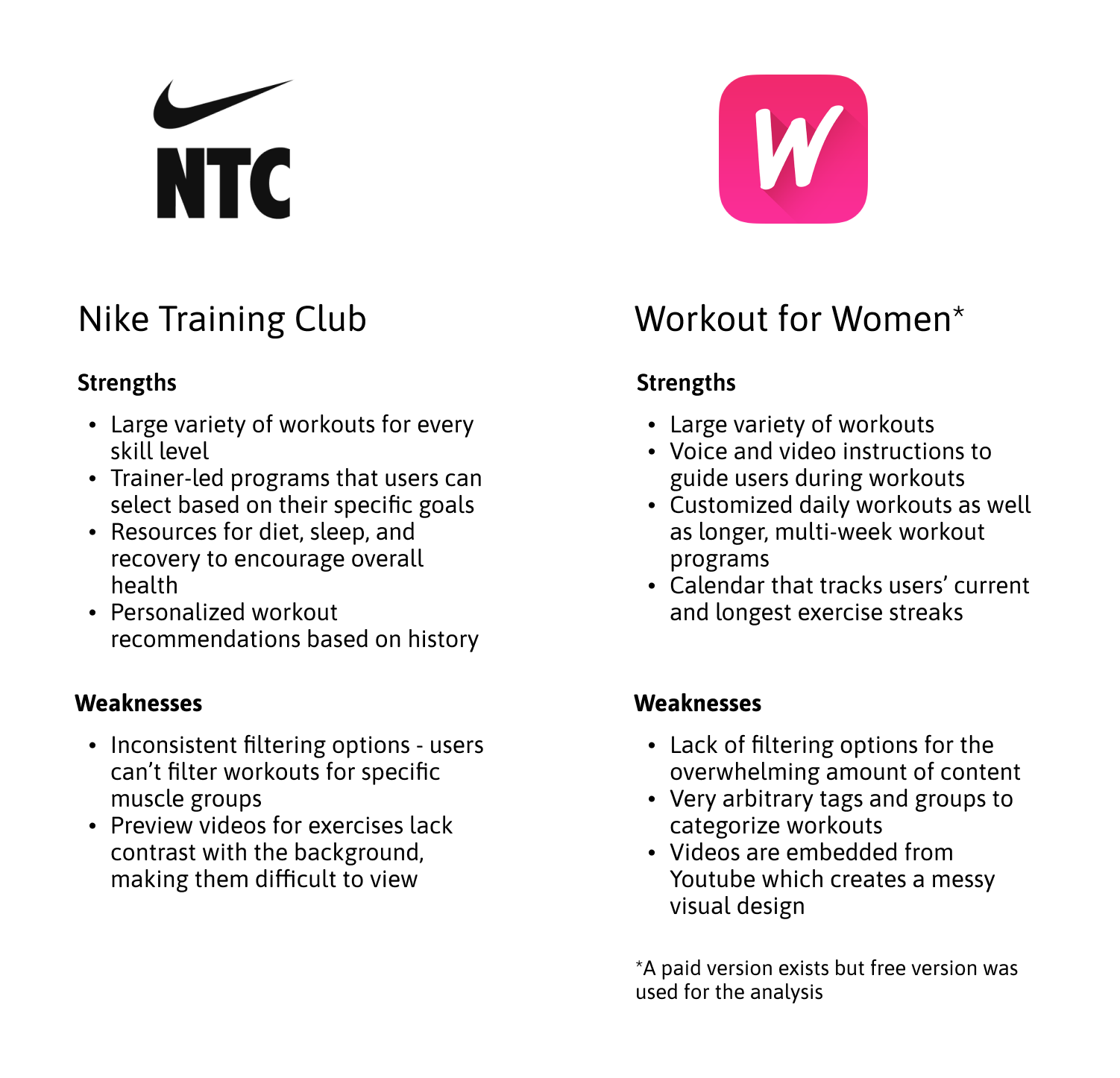
I started the design process by exploring the top competitors already in the market. I conducted a competitor analysis with two popular fitness apps: Nike Training Club and Workout for Women. I evaluated their strengths and weaknesses to establish the most essential features and the biggest issues my app could address.
Who am I Designing For?
The competitor analysis showed that varied content and clear instructions were the most necessary features, while organization and filters needed the most improvement. I attributed these features (strengths) and improvements (weaknesses) to two distinct people and created two user personas to answer the question, “Who will be using my app?” After all, it’s much easier to design for actual humans than it is to design for data charts.
Their Stories and Journeys
Tom and Sharon have their own unique goals and frustrations when using fitness apps. The former wants better organization while the latter needs more guidance and motivation. I created three unique stories that summarize their needs and journeys they would take within an app to achieve their goals.
User 1
I am new to working out, so I want to be able to exercise at home with easy and clear guides.
User 2
I want to be able to track my progress and hold myself accountable.
User 3
I need organized exercise routines to filter and find exactly what I want.
Sketching and Wireframing
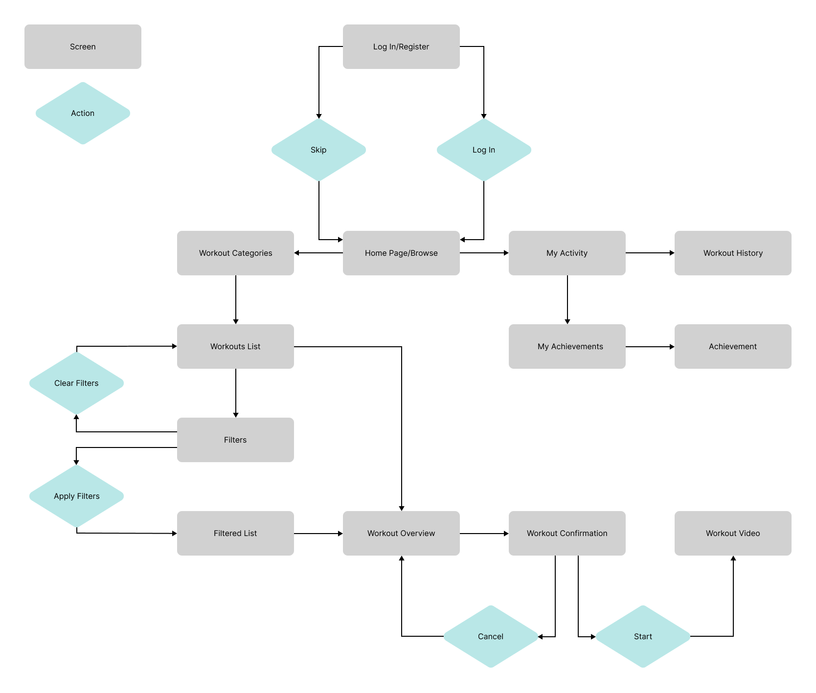
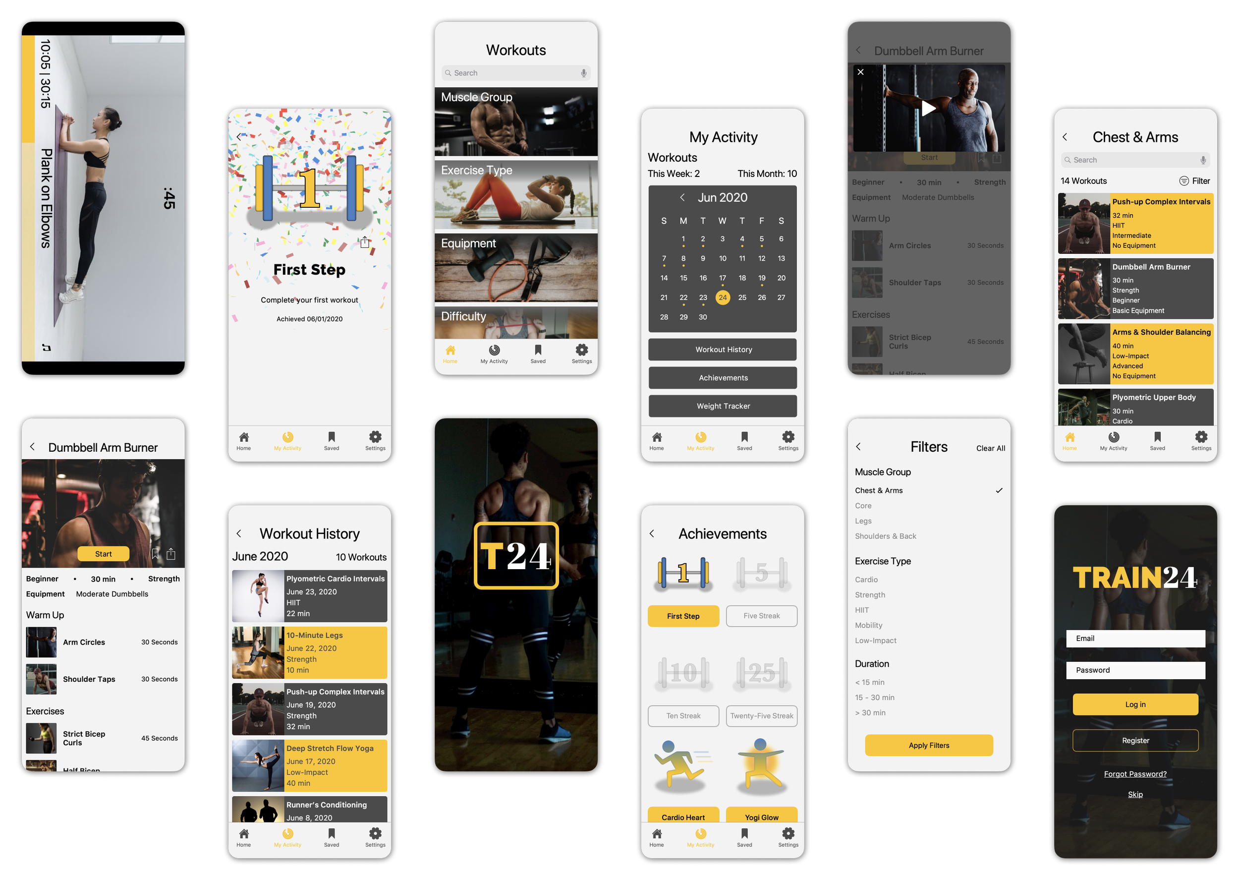
I had twelve screen states in my user journey to design, so I jumped into things by sketching three different versions of each screen. I chose from these sketches to develop them further; nothing was set in stone at this point, but I at least had a starting point.
I then created mid-fidelity wireframes using Sketch App and develop my ideas further. I relied on iOS-standard UI assets and created AnyGym as a placeholder name, so I could play around with the logo placement and design. With a clearer path forward, I shifted my focus to carve out a personality and brand image for my app.
Mid Fidelity Wireframes
Developing a Consistent Style
Before developing high-fidelity wireframes, I wanted a style guide that I could follow – something that would create a cohesive image. I envisioned a motivating, welcoming, and trustworthy environment – qualities our users want. After some brainstorming, I changed the app’s name to Train24 and crafted brand guidelines to use.
Usability Testing
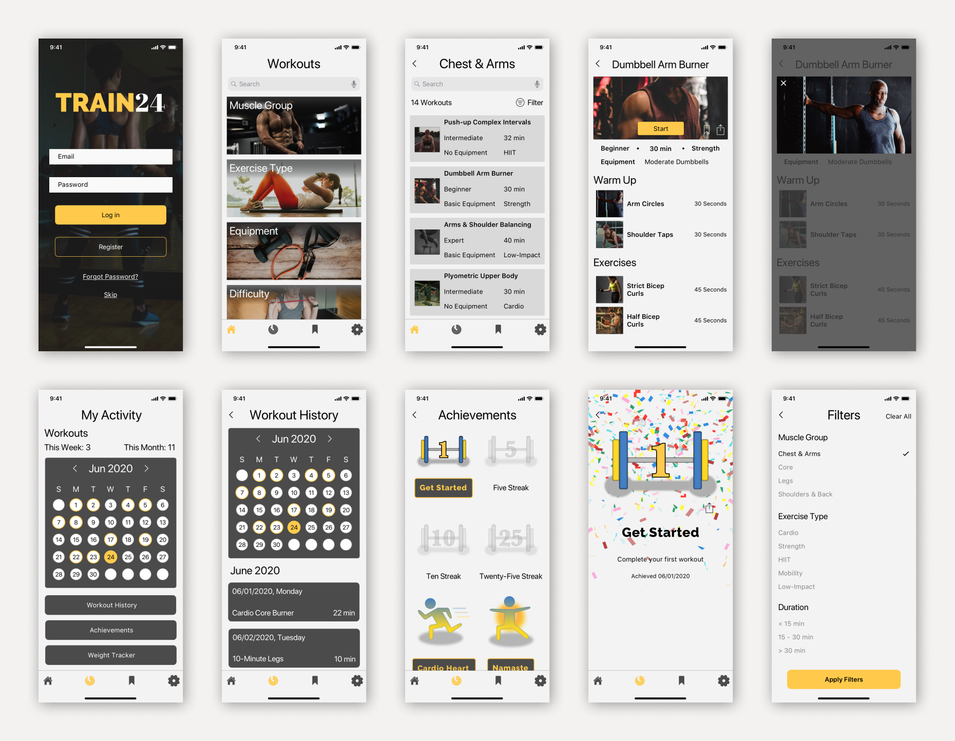
I used my brand guidelines to create high fidelity wireframes with some minor tweaks and updates. I generated a preliminary prototype using InVision for usability testing with five participants.
Instead of sticking to a script or having testers complete specific journeys/tasks, I conducted more open-ended sessions and asked testers to explore the prototype. We then held remote discussions about features they liked or disliked, especially focusing on confusing or frustrating areas they had trouble navigating.
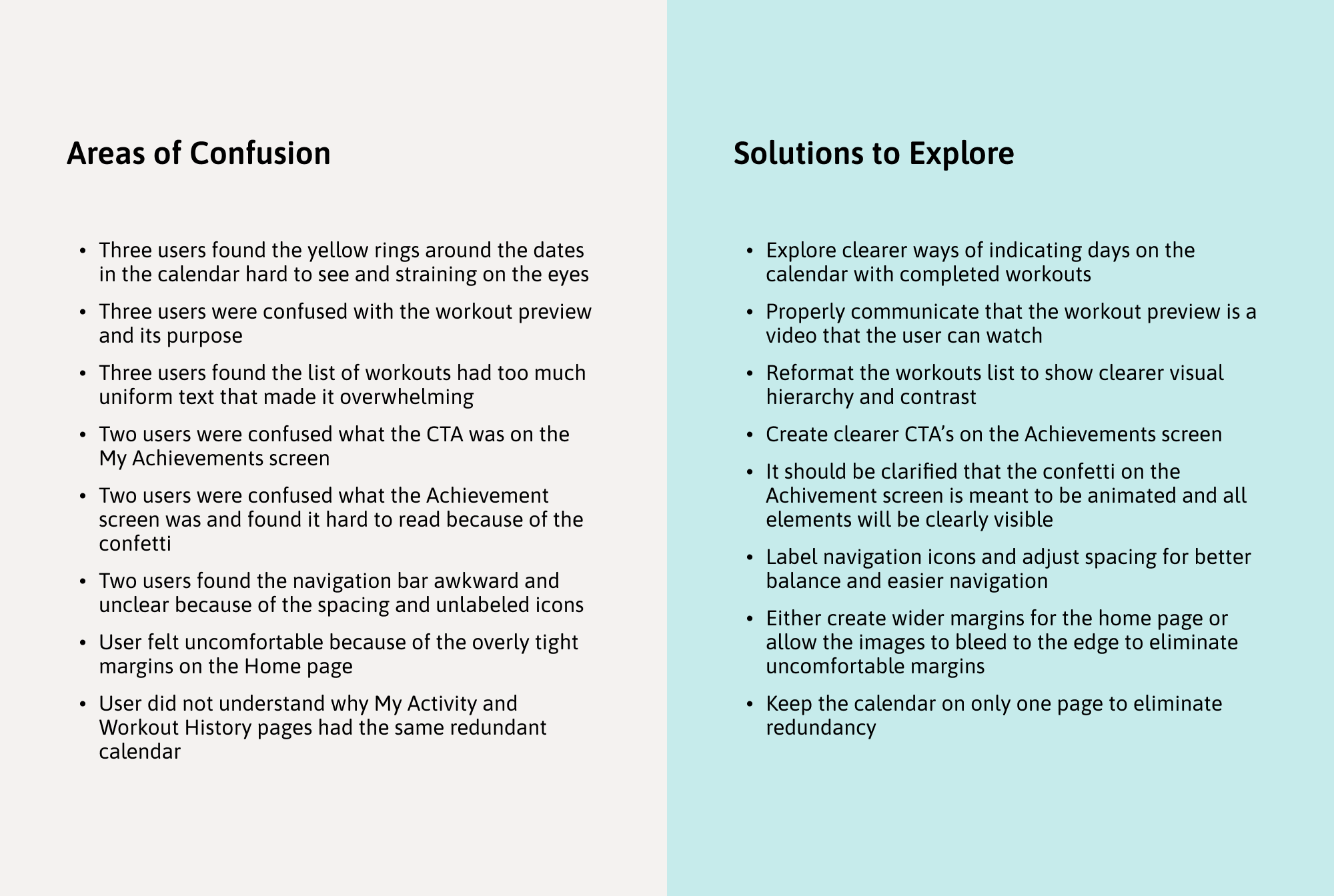
Usability Test Results
Refinement
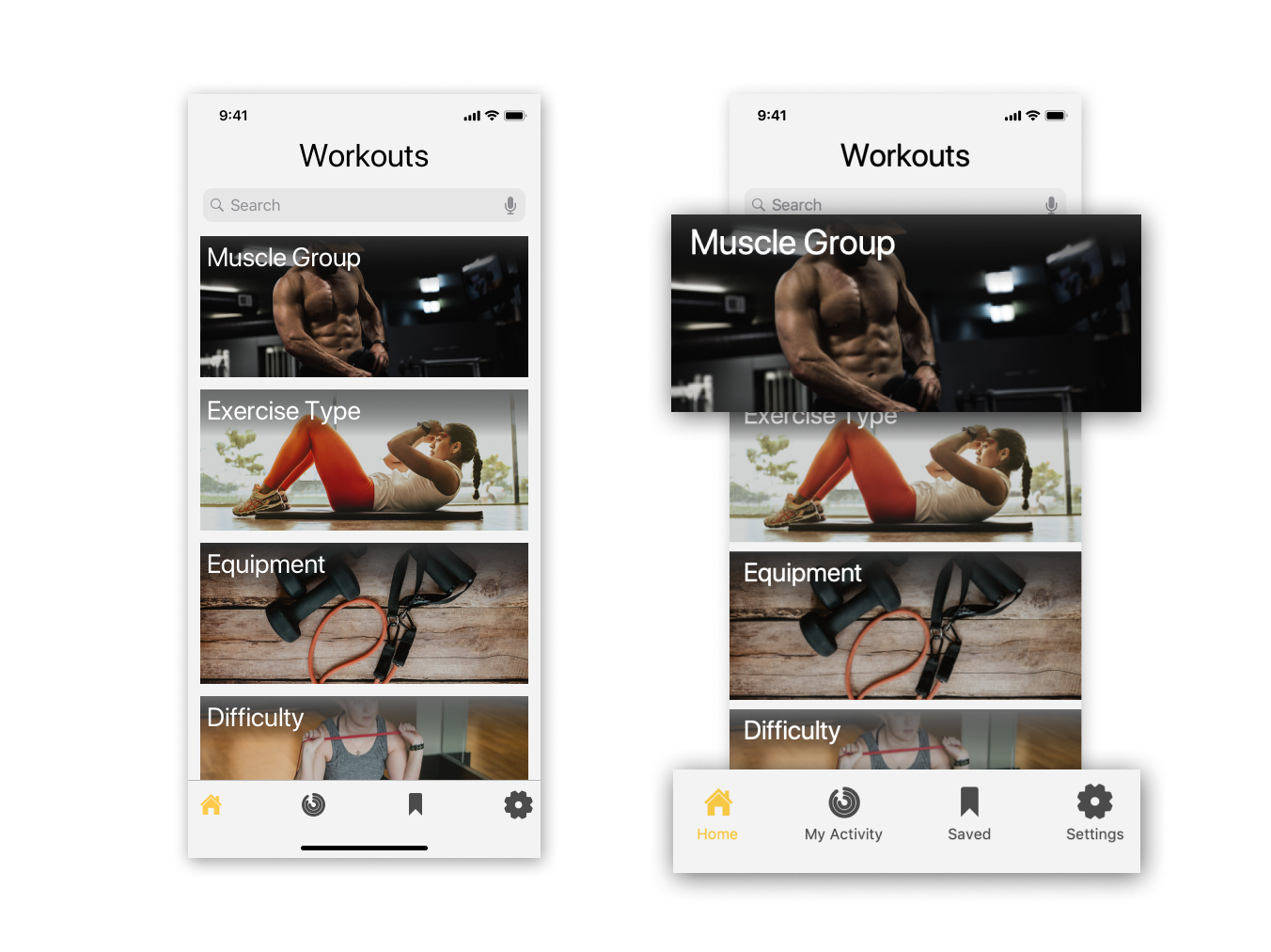
I extended the home page images to fully bleed off the screen and remove any uncomfortable margins.
I labeled the navigation icons and adjusted spacing to avoid confusion and create better balance.

I applied the button design guidelines to indicate clearer CTA’s to view unlocked achievements and disabled buttons for locked achievements.
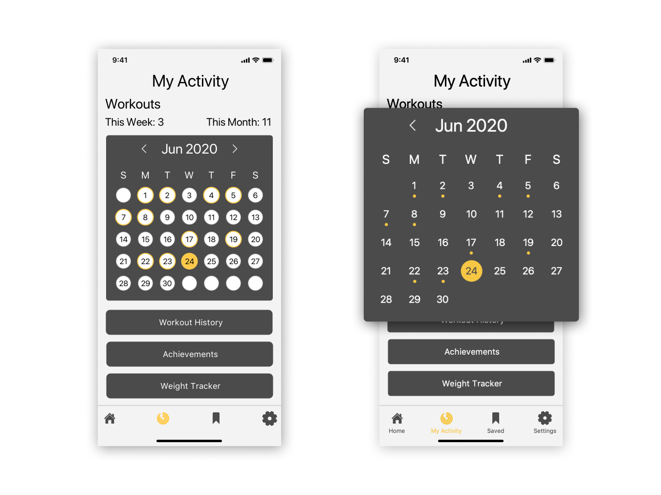
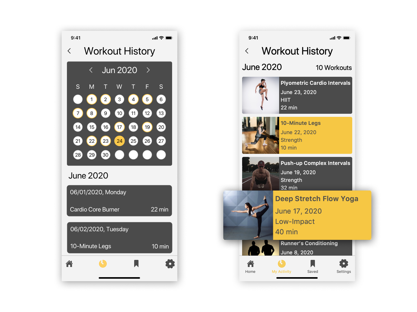
I replaced the yellow rings with easier to see markers underneath the dates with completed workouts.
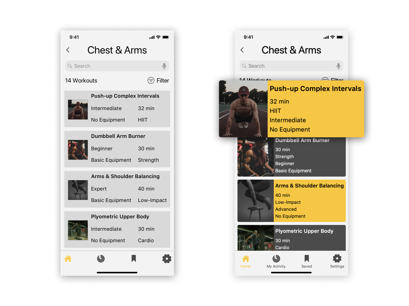
I reformatted the text in the workout cards to show clearer visual hierarchy.
I expanded the imagery and applied the color palette to create a more dynamic screen.
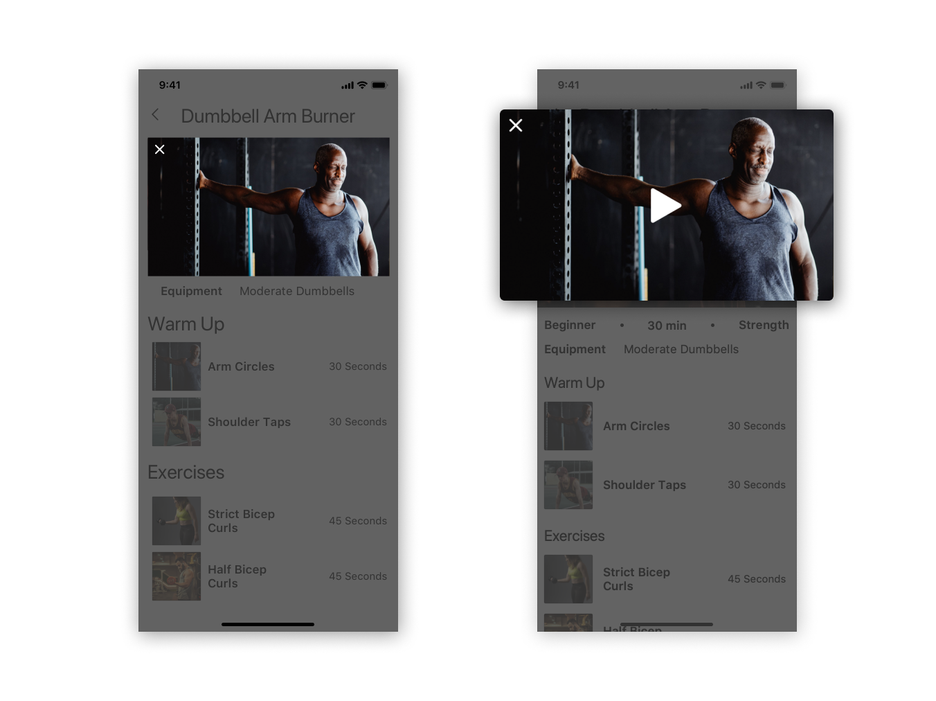
Though the workout preview was already intended to be a video, I implemented a play button so its purpose is clearer.
I applied the format of the workout cards to reinforce visual hierarchy.
To avoid any redundancy and wasted space, I removed the calendar which is already on ‘My Activity.’
Looking Back
While I was able to design an app that addresses user needs, there is still much more to do. This process also had its challenges and flaws that if I were to revisit, would definitely approach differently:
Scope and constraints of a student project: Because this was a student project and not a “real” product, there weren’t any realistic constraints. I didn’t have to consider strict deadlines, budgets, or working with product owners. I wasn’t balancing multiple projects (not including my full-time job of course) or considering coding constraints either. There was really only one round of usability testing towards the end, and the user needs developed from the competitor analysis were determined by myself.
Reliability of usability testing: A more thorough analysis of the testers’ demographics would have provided more insight into the results. Unfortunately, I didn’t inquire about the testers’ ages, fitness levels, experience with home training, etc. The remote testing process was unsupervised, and users weren’t instructed to complete specific tasks or journeys. As a result, I received much more feedback regarding the visual design than task completion or pain points. With more precise usability testing and analysis, my designs would have been better-informed and intentional, rather than based on something “users found awkward or confusing.”
I became more aware of my weaknesses as a designer, flaws in my process, and the importance of an in-depth and detailed research process to create a product that actually addresses user needs. In the future, I hope to conduct additional usability testing that is fine-tuned so I can update my designs into something that could exist in the real world.